'On Cloud 9'
Digital Credits:
Everyday Alpha Pack
Retro Vector brushes by
Obsidian Dawn
Other:
Woodgrain Embossed Overlay by Emma Stafrace
Pea Miss Priss by Kevin & Amanda Pea Fonts
Impact Label
Impact Label Reversed
PART 1
Creating a Digital Photo Mask
To make this project you will need some
Intermediate Photoshop knowledge.
Step 1:
Open a new blank file
setting the resolution to 300 for optimum printing / RGB Colour
Mode/transparent file (NB: For the purposes of this article I have made my
background white). From the brush palette select a fun shaped brush like a
halftone dot. This design works well because the central area is a solid
colour. Then select the colour you want to use and stamp the brush onto your
blank file. This forms the basis of our digital mask.
Step 2:
Open your photo file. If your using a colour photo convert
it to B&W then click enhance /adjust colour/colour variations. This will
open a dialogue box, which has a series of different values that we can tweak
to alter the photo’s colour so it resembles the same colour of the brush we
stamped in step 1.
Step 3:
Drop your coloured photo onto
the mask and position so it is centred. Highlight the photo in the layers
palette, whilst pressing the shift key hover your curser between the two layers
and press click. This will engage both layers and form a clipping mask. You
will notice in the layers palette that the top layer has shifted to the right
and an arrow appears pointing to the layer below. To remove the defined
rectangular edge of the photo select from the erasure tool palette a soft edge
basic brush. Then carefully delete areas of the photo so as to soften the
defined edges until your happy with how it looks.
Step 4:
Combine the layers by
highlighting them in the layers palette and select merge layers from the drop
down menu. Now you have a cool halftone dot photo ready to include in
your
digital and hybrid project.
.....................................................................................................
PART 2:
Creating a customised rub-on.
When I designed my digital
page incorporating the halftone photo we created in Part 1 I set my dimensions at
3600 x 3600 pixels with a resolution of 300 pixels per inch. This way when we
print our file it will transcribe into the same size format of a traditional
page. I also cropped my original b&w photo using a triangular cookie cutter
in PS for some extra visual impact. There are plenty of shapes to choose from
so try some out and see which one works best for you.
Now that I am happy with my
digital design I am going to keep the editable PSD file open so I can begin the
cut & paste steps to create the printable word document.
‘On Cloud 9’
Materials used.
Woodgrain Embossed card stock- Spotlight
Grafix Rub-Onz
Hero Arts Cling stamp- Stripes Pattern
White Acrylic Paint
Versa Color Ink- 11 Canary
Tattered Angels Glimmer Mist- Cinder
Memories Mists- Mango Lemondade
Dimensional Magic
Black Dymo Tape
Washi Tape
Toothpick
Masking/Scotch tape
Chizler/Paper Creaser
Scissors
Microsoft Word Program
Printer
Step 1:
Isolate all the elements you
want to print as a rub on, including the halftone dot photo mask we made in
Part 1. Merge those layers together and then select cut. Open a new file and
paste them into it.
Step 2:
The new file needs to be flipped
so it becomes a mirror image. This is a very important step
before printing.
Once completed save as a .jpeg file onto your desktop.
Step 3:
Open
a blank word document setting the margins as wide as possible, then insert the
.jpeg file. It should remain the same dimensions as was formatted in your
digital page assuming that you create your digital pages in the standard size
format of 3600X3600 pixels at a resolution of 300dpi. Insert the printable sheet of Grafix Rub-Onz
film into your printer and set your printer options at Transparency media type.
This will prevent any excess ink and bleeds during the printing process
Step 4:
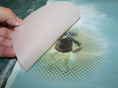
After the ink has dried on the
transfer film we can adhere the clear sticky film over the printed side of the
transfer film. Instructions are included in your Grafix Rub-Onz pack. Using a
chizler or paper creaser carefully smear any bubbles out making sure to not
puncture or tear the surface.
Step 5:
Cut around your design as
close to the edge as possible.
Then
peel the shiny adhesive backing off from the underside of the custom rub-on.
Step 6:
Carefully lay that onto your
base paper and rub gently until the opaque film turns a whiter shade. Now peel
that layer off revealing the rub-on below.
So there you have it, a really fun way to showcase
all of your favourite photos. Creating the mask allowed us to use the original
photo in a different way. Then by cropping the b&w photo into a different
shape and overlaying it on the masked version created a visual impact that far
surpasses any standard photo format. I hope this inspires you to look at your
snapshots differently and hopefully try this technique out yourself!


Haven't the fogggiest idea of any of this...but I really LOVE your LO!!!! The way you incorporate shapes into your designs is just really, really soooo creative & original....as for the process.....I'm obviously not a digi scrapper atm:):)!!!!!! Never say never...........
ReplyDeleteFabulous! Looks so cool! Love this lo!
ReplyDeleteEmma you are so great to put these tutorials up....yes I'm dabbling in the world of PSE and this is easy to follow, great LO as usual...I love the story each page tells, just hints of layers and pop!! Just awesome xx
ReplyDeleteThanks for sharing your process, Em!!!!! ♥
ReplyDeleteTotally lovin your art,...amazing ...xx
ReplyDeletegorgeous layout - thanks for sharing this tutorial (one more thing I need to try out some day :)..)!!
ReplyDelete